Brand
Antsfield brand kit
Logos, naming, and usage guidelines for presenting Antsfield consistently across product, marketing, and press.
Download brand kitNaming
Antsfield is the brand name and always spelled with a capital “A”. It is a single word and should not be spelled as AnTsfield, "antsfield", or any other variation.


Wordmark
RecommendedThe Antsfield wordmark is the defacto, streamlined representation of our brand, designed for clear visibility across both digital and print platforms. It embodies the brand in its most recognizable textual form. When utilizing the wordmark, it should be maintained in its original design and proportions to ensure consistency and recognition.
Logo
The Antsfield symbol is a distinctive element of our brand identity, optimized for impact and recognition across various media. This symbol distills the essence of Antsfield into a concise visual form that is immediately identifiable. It is essential that the symbol be used in its original design and proportions to maintain brand consistency. Its use is particularly valuable in contexts where space is limited or where a more graphic representation is needed over text.
Colors
Antsfield's visual identity primarily utilizes black and white for marketing purposes, symbolizing simplicity and elegance. These two colors should be consistently used across all promotional materials to ensure brand recognition and coherence. While our brand includes a broader palette of colors, these are specifically reserved for internal use by Antsfield and are not intended for external applications.
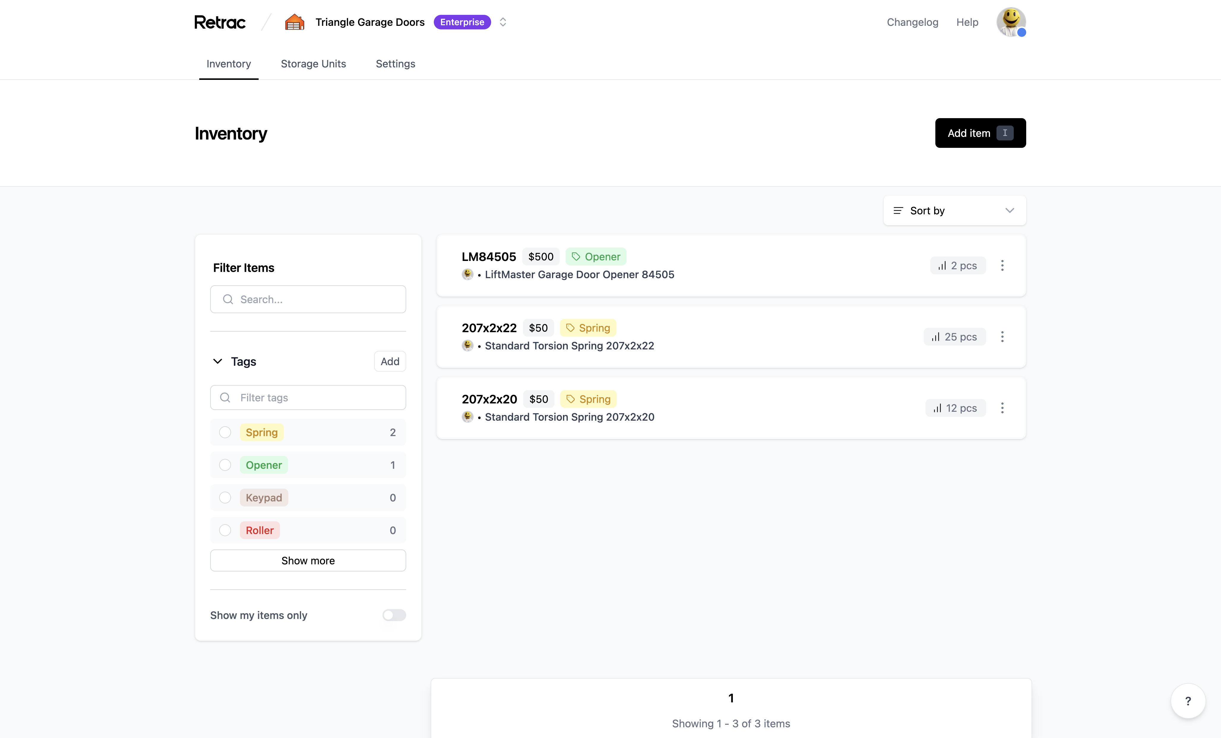


Screenshots
Use the following product screenshot when presenting Antsfield to avoid showing any sensitive information.
Please contact us if you need additional assets or have questions on how to use the Antsfield brand.